Please include why the pic was shot (what you are showing off), what you like about the picture, and what you don’t like about it. This gives people something to work off so their comments make some sense.
There are already a million threads and youtube videos about how to shoot pictures of various objects, to include firearms.
Anyone can post a picture in this thread, HOWEVER, by posting in this thread you are showing that you are open to the opinion of others. The firearm MUST be yours (unless a military weapon or of someone else shooting), and the picture MUST be one that you took.
Give a little info about the picture and state what you do or don’t like about it. Other people posting are expected to give comment in a professional manner, meaning that “you suck” comments aren’t going to fly. Opinions vary, which means people posting should remember their view are subjective, and no one likes to be insulted for no reason. Be nice, be respectful, be HONEST in your thoughts. I don’t expect people to like everything we (wife or I) shoot.
Lastly, this is NOT a how to thread. Don’t have hurt feelings that people don’t want to tell you their secrets, and many guys lie to pretend they don’t use any post processing. That doesn’t matter as that isn’t what this thread is about. This is a critique thread about the picture itself.
I’ll start with a critique of one of mine, feel free to include your own thoughts. The idea is that we will all learn (hopefully).
Why it was shot: This pic was shot to showcase the Magpul AK furniture, so the idea was to blend the Russian “feel”, with the newer US items.
What I like: I think the Soviet uniform helps with the overall image, and the lack of, or muted colors works with the overall concept.
What I don’t like: In general, the image is a bit too centered, and while I don’t mind breaking the rules, it doesn’t change the subject would be better placed off to the side.
Here’s my first SBR a Daniel defense complete MK18.
It’s essentially a safe queen not the gun to shoot at the first gonna grab. It’s Cerakoted in tungsten grey I had to Cerakote it because my first NFA engraving turned out horrible barely went to the anodizing didn’t scratch the aluminum so I had to take off the finish, sanded it down to the bare aluminum and get it re engraved. I’d much prefer if it was still anodized. It’s over gassed so I don’t prefer to shoot it. It was my dream gun so I went all out on it and now I don’t even use it.
Springco Blue, and at age 3. But I’m gonna switch it to a colt barrel with a proper spec Gas port in the next few months here hoping that will help it.
I used to dabble with a Canon 6D for a while. I never got great with it but really enjoyed doing it. I snapped this in my front yard just messing with settings on the camera. It is my HK MR556. (Also my profile pic) I was trying to play with the shadow around the gun to give more contrast without dialing it up in photoshop. It was a photo I was taking for an online blog.
You didn’t list what you were trying to do with the pic, what you liked, or what you didn’t like. That makes it difficult to keep any feedback in keeping with what you were trying to do.
First and foremost, if you are going to take pictures, carpet is never going to be a good overall look. Your lighting appears nice and even, but it still doesn’t make anyone take real notice as it is still “a gun on the floor”. Had this same picture with same lighting been taken on concrete, it would have had a more industrial look (especially with those colors) and it would have been a substantially more viable image.
The second thing would be to fold the sling up in a manner that doesn’t look like a drunken snake. Slings are hard to make look decent in pictures, which is why they typically aren’t used in adwork.
The easiest way to shoot decent pictures is to wait for a cloudy day, then put the weapon down on concrete. Presto, easy, simple, and good picture. Even with a cellphone they turn out great.
Oh my bad I misunderstood, I thought this was just critiquing of the Firearms, not the photos as a whole.
Let me try this again.
One of my favorite pictures I’ve taken
The the focus of the photo, being able to capture the firearm while still getting a detailed image of the branch it’s resting on. I wasn’t using a tripod, so it made it difficult to hold this while trying to get a clean shot of the dot, it proved too hard. I do wish I had moved that front lens cap out of the way to maintain a feel of symmetry to the firearm . I also like the feel of a foggyness of the photo, this was done only using the manual focus of the lens on a clear blue day. The filter enhanced it but it was there before I edited the photo.
With regards to “a gun on the floor” picture… Do you feel if an individual were to include their feet in the photo, should they match their socks to the carpet, or should they match them to the firearm?
Thoughts?
Of course we all know that bare feet are just nasty & should never be included…
[emoji14]
Congrats on your own sub-forum Stick! Thanks for your service & keep up the good work.
Oh man I’m going to like this thread. I’ve been thinking about taking some photos and the first thing I thought was ‘I wish I could get Stickman to have some thoughts on them’. I figured that would be a non starter. Now I have good excuse to go for it.
On your photo, which looks different to me when it’s displayed in small size vs blown up on screen. I like the things you mentioned but the thing that hit me was not what you intended to convey regarding the “why it was shot”. What hit my eye was his chin / neck and the shadow in the center. It is so symmetrical his chin looks like a birds wings or some sort large insect or such. Like a shadow of an alien cast on him. It’s so contrasty it draws my eye from the intended subject. For whatever reason when it’s blown up it doesn’t seem to be as noticeable or drawing but it’s still there. It’s like two subject’s in the photo and his chin/neck takes top seat. The centering really doesn’t bother me.
The whitebalance is a little off to my eye (and calibrated monitor), but that is something which is subjective. For me personally, if it were shifted a bit more to the cool side, the picture would give that crisp cool feeling of a early morning cold foggy day. I love the depth of field, especially that it also shows the branch. The dead center offends me a bit, but not enough to make me vomit like feet in a picture or anything like that. Overall, this is good (to my eye).
Glad you like the concept, I think it will be fun. The chin is in the picture to give a little more humanity, but to remove the facial features. When there is a human head, we automatically look as viewers into the face and eyes and it becomes the focus of the pics in the vast majority of cases. I agree viewing on a phone, versus a larger monitor makes a big difference. Thanks for the input!
I would have no problems personally beating people who put feet in photos, especially bare feet. No one wants to see hairy hobbit toes, some of us could be eating!!
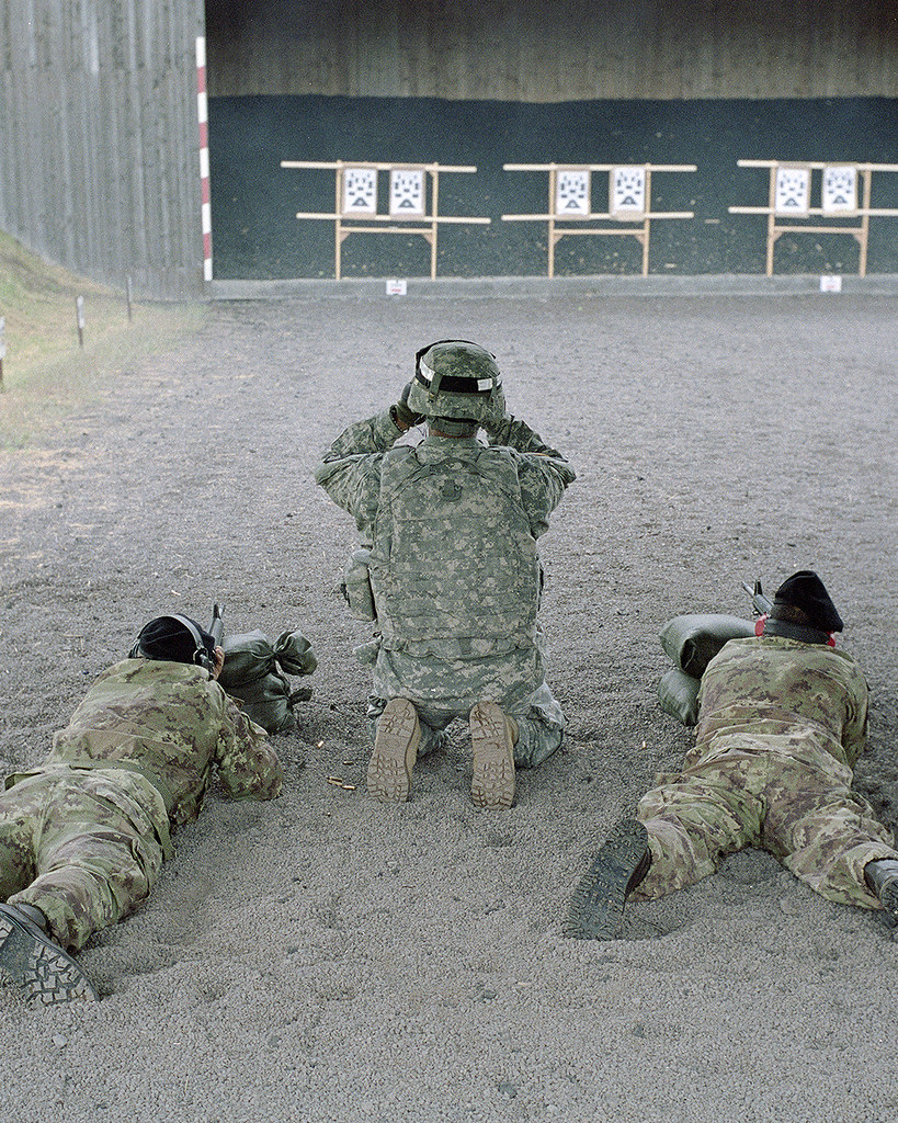
I’m breaking one of the requirements, which is that I don’t own that 249. Couldn’t resist to participate in a photography thread!
Why: I had a chance to break out of the mundane office to run around the Monte Kali event in Germany, pretending to be Public Affairs.
Likes: Unity of nations coming together to participate in such an awesome event. Not the standard “action” PAO shot. I had been very conscious about the cardinal 3’s in pattern during this day.
Dislikes: Not having the proper credentials, I wasn’t able to get up all in there. Typical military safety rules kept me behind way behind the firing line and stuck with a 35mm lens.
I think we can let it slide when we are talking about military weapons. I get what you mean with rule of threes, but in this case wonder if the image itself wouldn’t tell a better story if it were cropped to just the two individuals. Then again, I don’t think the way it is framed, and what you had to work with really gave you much choice but to end up with what you have. The lighting is great, the instructor on the far right becomes interesting and is telling a story with his movement, and that comes together nicely. The US trooper on the left doesn’t do much for the shot, but having him cropped and partially in the pic wouldn’t have worked well at all in my opinion.
A great picture would have been shooting with a 24 or 35mm from on the ground to the left of the gunner looking up and over his shoulder at the instructor. However, we are stuck with what we can do at times.
Thanks for the critique Stick! I probably should’ve revised my original post to accommodate for the series I made from that day, there isn’t just ONE photo that was strong but altogether in a booklet I made it worked out. Again, handicaps with range safety aside: your suggestion of getting in close to the left of the German gunner’s side would’ve worked well. I didn’t think of that until you mentioned it. It’s nice to reflect back on old work, figure out what worked and what didn’t so we can apply it to the next “assignment.”
I’m a huge photography nerd and study quite a lot of it. All are shot on film, Portra 400.
Here’s another from the same day with the pattern of 3’s again. My dislike with this is that I could’ve waited a little longer for the rounds to hit the backdrop and dust to kick up for a more lively photo.
I took this one a few years ago with a Canon Rebel XS and a 50mm I think. I was trying to capture the action of the shot. The FPS on that camera is not very high so I was having to time as best as I could. What I believe is the projectile ahead of the muzzle was the cherry on top. I’m curious about thoughts on the composition for firing shots. The light could be better but it was what I had to deal with. Also curious on how others may have processed it?
Overall, I really like this shot and my buddy was stoked with it.